...down to preserve
For the successful presentation of the traditional brand WECK at Ambiente 2026 in Frankfurt, we were commissioned to design, plan, and realize the exhibition stand.
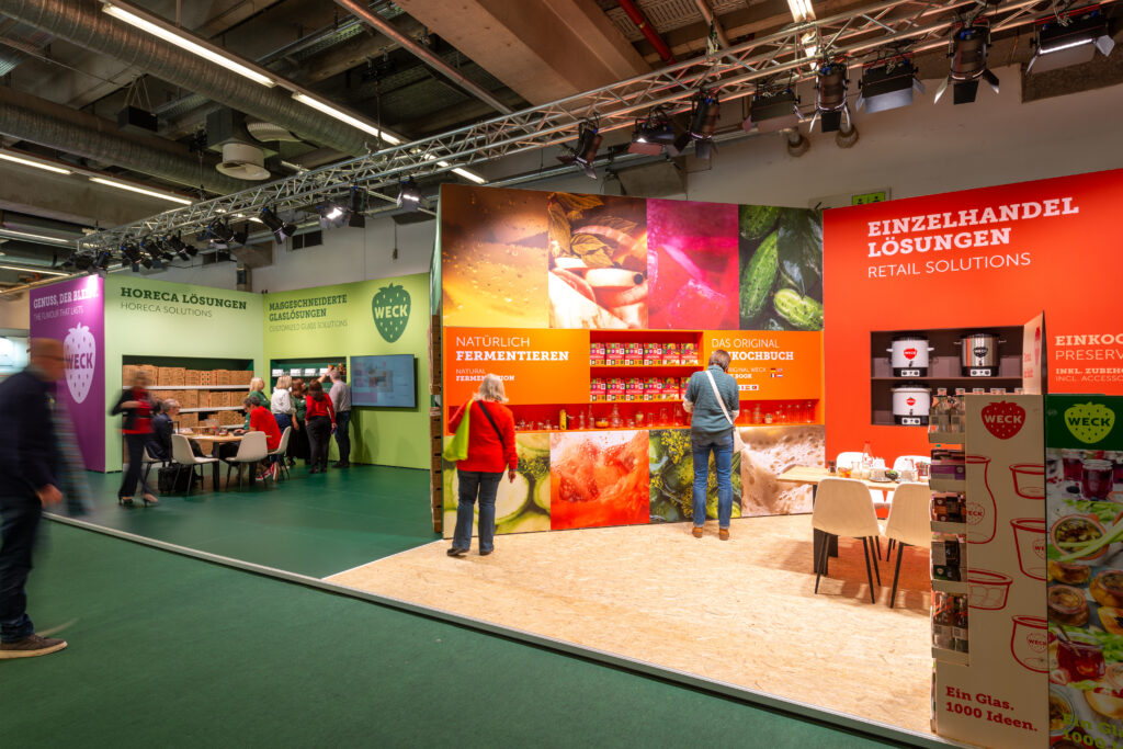
A bold showcase of product diversity
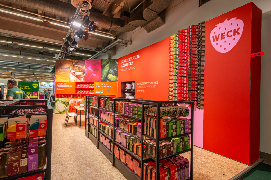
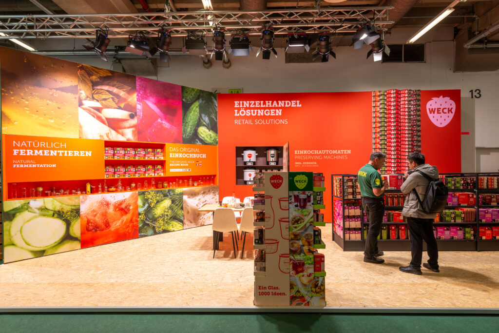
At the core of the stand, a product wall defines the space: jars of varying sizes and forms are arranged in the new packaging. The composition creates a precise visual focus and makes the breadth of the WECK range immediately legible.
A key feature is the new preserving book, presented within a purpose-designed book wall. The wall acts as an interface between wholesale and retail— a clear link between the two core areas
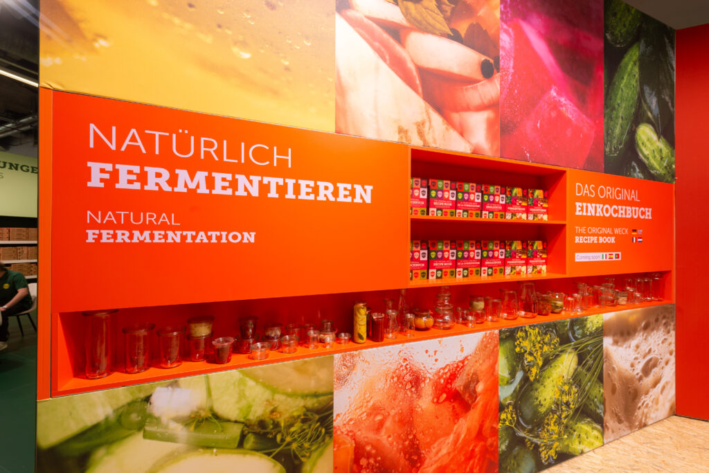
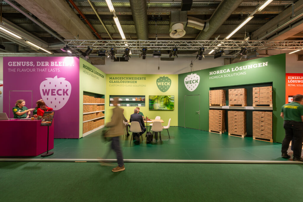
Colour coding as orientation
The luminous WECK colour palette not only adds aesthetic value but also provides orientation:
- Green marks the wholesale area
- Orange identifies products and packaging for retail
The colour coding extends across walls and flooring, enabling visitors to intuitively navigate the stand.
Sustainability as a key principle
Sustainability was a central aspect of the design. Furniture and display elements were selected with reusability in mind—creating an exhibition stand that not only makes a strong visual impression but also meets high ecological standards.